When we first met in 2014, I could sense you were ready to conquer the world… What was your plan?
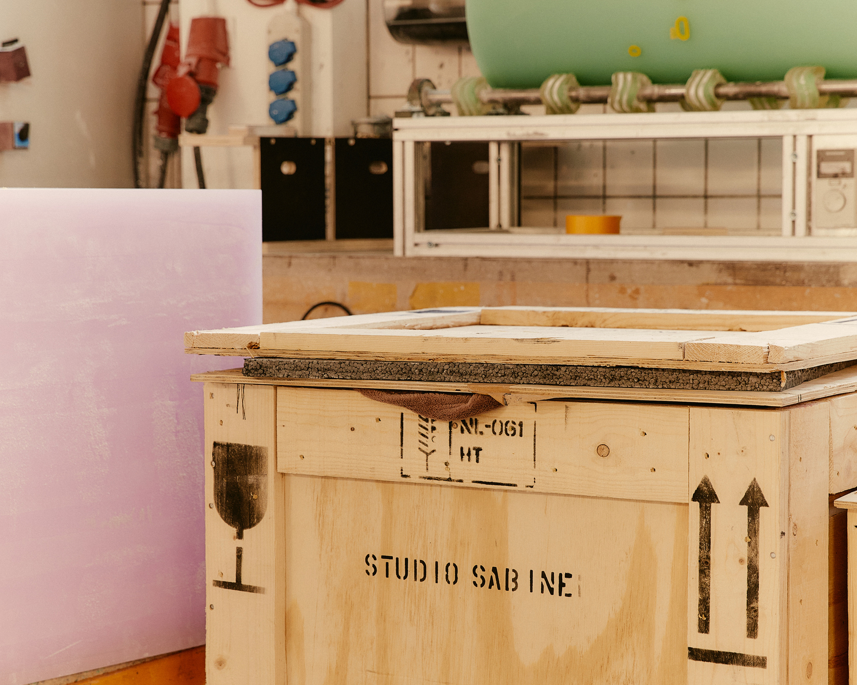
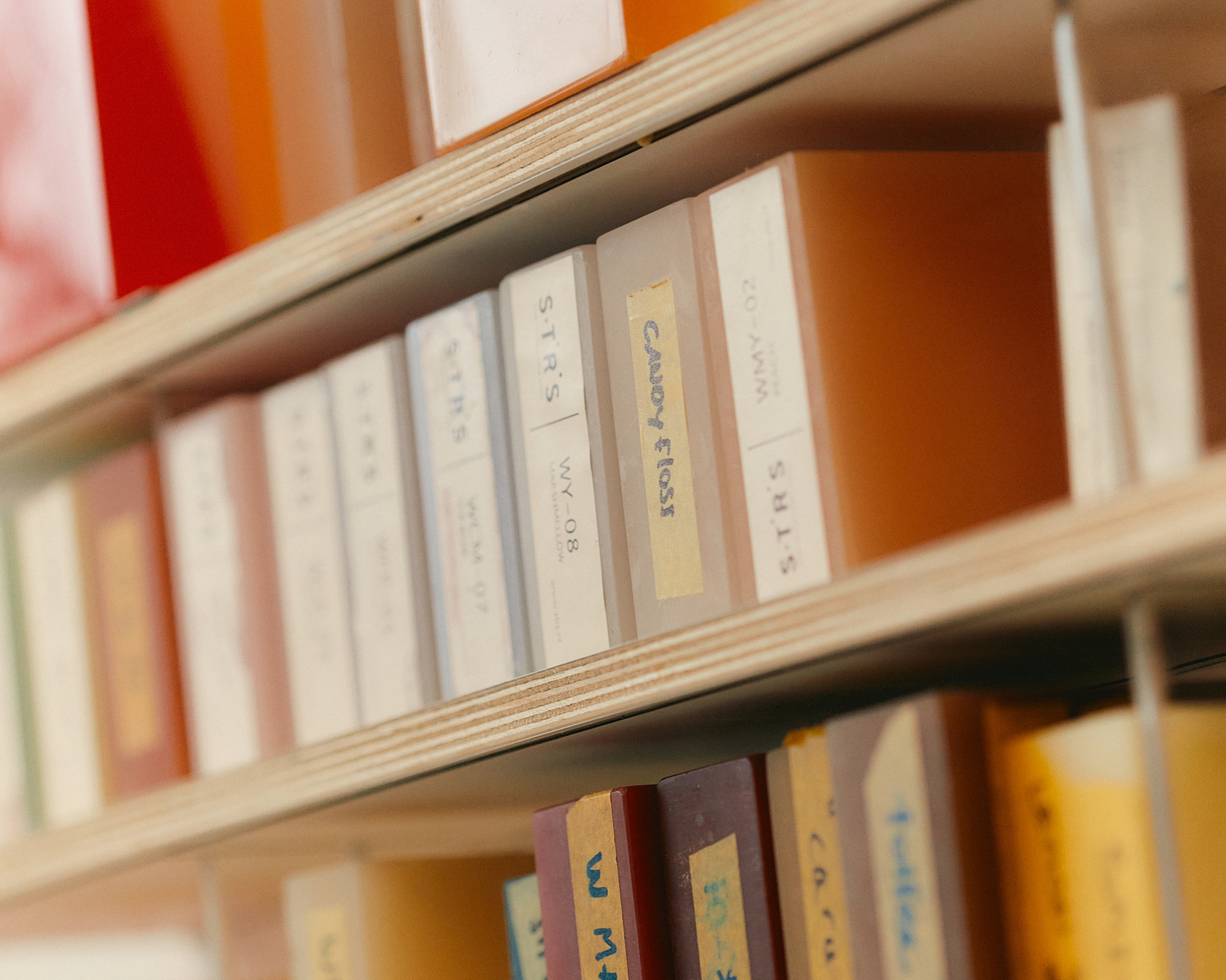
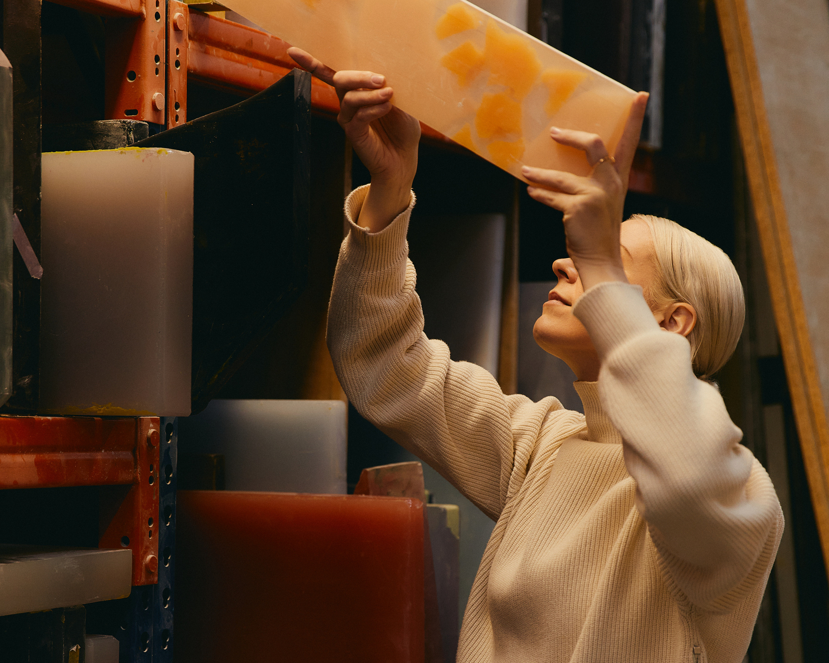
From the beginning, I wanted to produce collectible designs: It would give me total freedom to experiment. But during those first few years I was a one-woman show, so when things started to get busier, I took on an intern, and soon after that I splurged on a studio manager. That really gave me the ability to extend my vision. I also realised early on that my strength lay in collaborating with companies that have expertise in materials and production. Like S.T.R.S. for instance, who produce all my resin pieces.
Did you have a space already?
My first studio was very big, in this idyllic old part of the Rotterdam harbour. It was really run down though: it had stucco angels on the ceiling and we had to nail them in place with bits of wood or they would fall down on us! In those early years I worked for artists and fashion designers, figuring out how their ideas could be realised. I loved crawling into their brains to figure out what they wanted.
Is there a relationship between your work and the process of fashion designers?
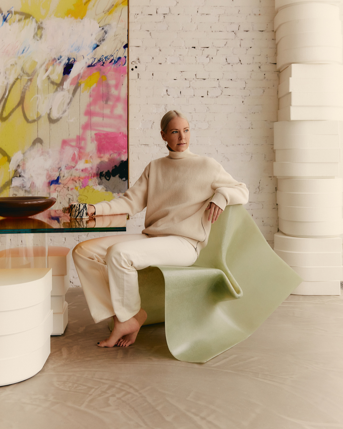
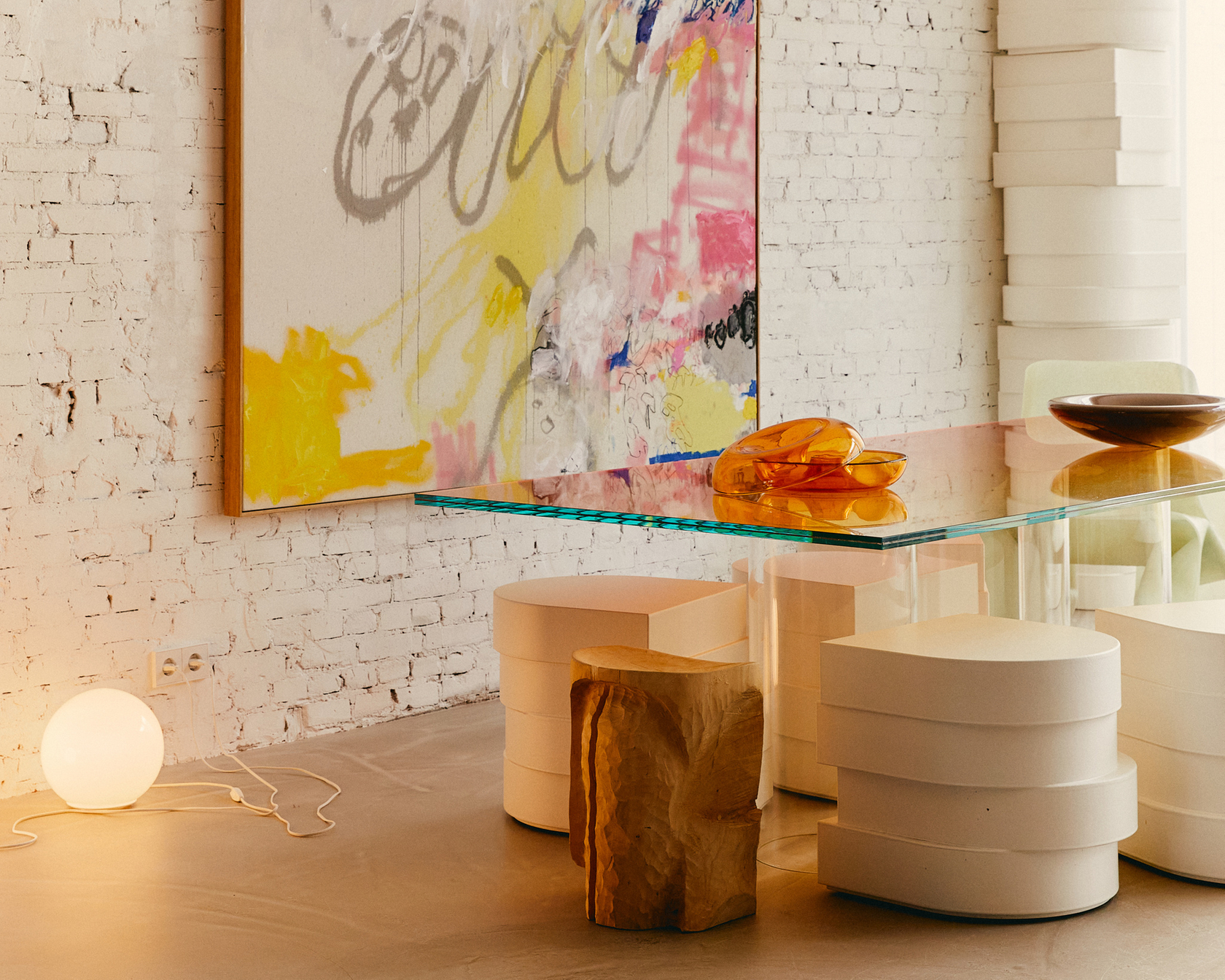
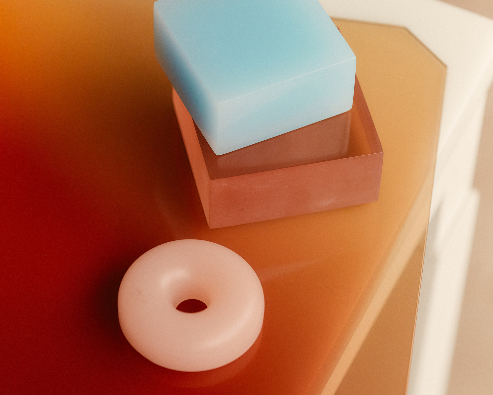
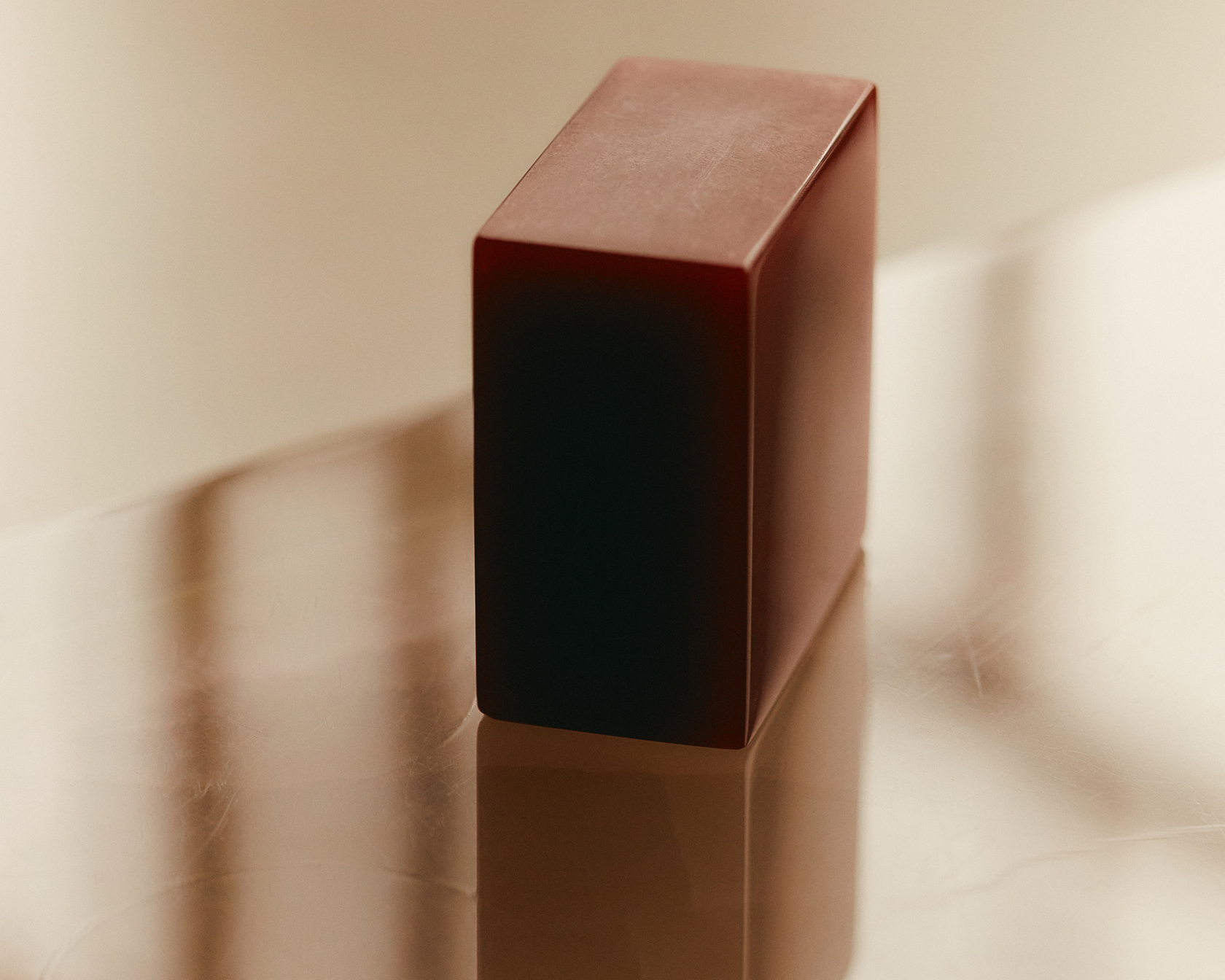
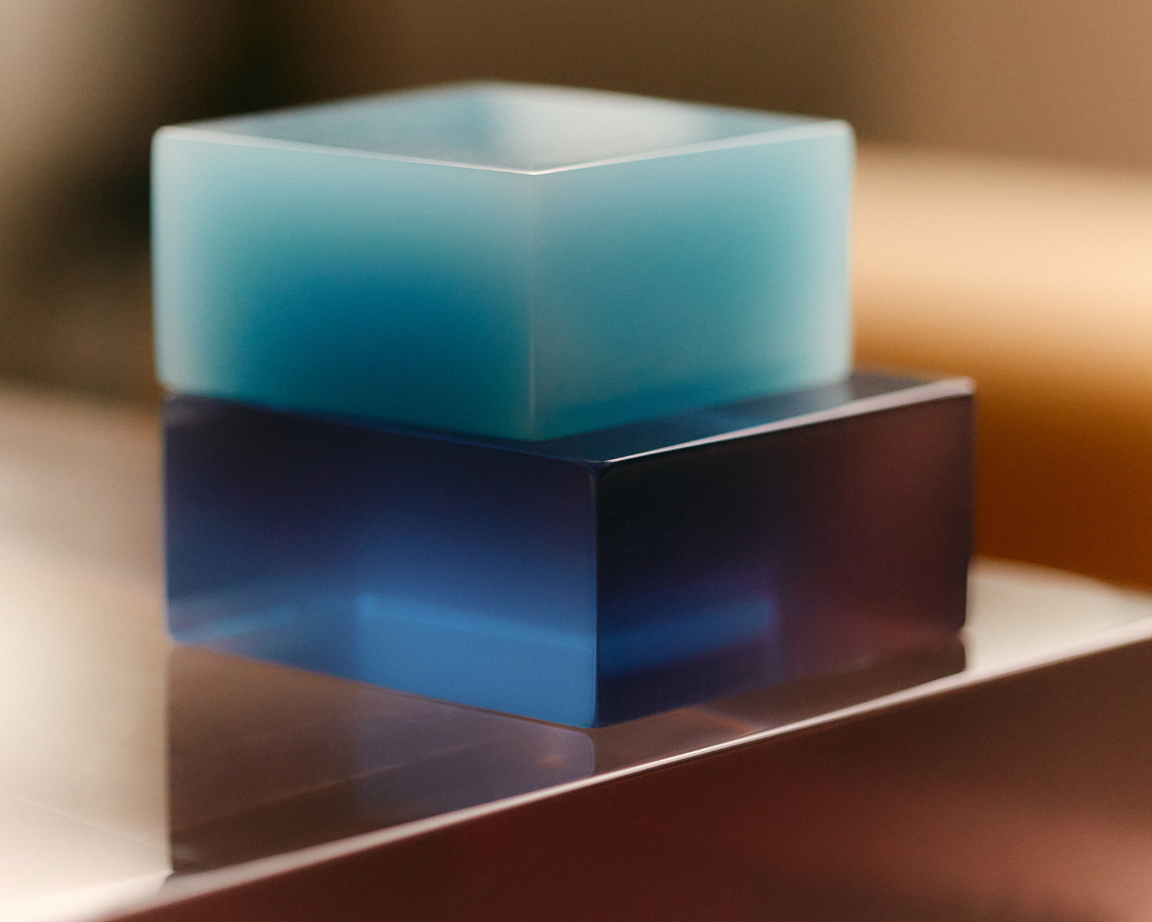
We both work with a limited material palette and try to make the most out of that. Fashion designers find expression in playing with silhouette, layering and pleating. My material palette is mainly made up of cast resin and laminated glass, and I’m always looking for ways to get more out of them, like: can we cast the resin bigger, or what if we bend the sheet after casting? Or when I want light to bounce off something, I take a shape that does that best. Form is a tool to shape the effect of materials.
Speaking of light effects, I saw a few stunning aeroplane window skies on your Instagram.
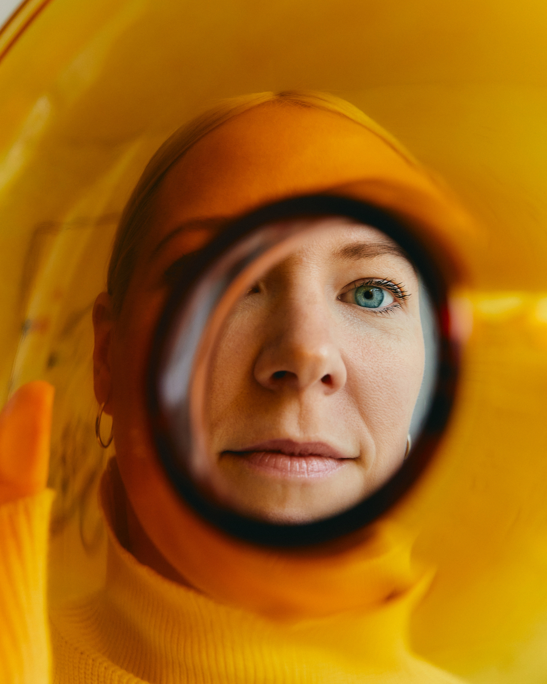
Nature is my biggest influence and inspiration. You have incredible clouds and surreal sunsets. A ripple in still water, the shadow from light filtered through a material… In nature there is always something to grasp. Snow is also amazing, it has this crazy texture. I used to snowboard a lot and when it was cloudy, I wore red goggles to be able to perceive more depth. I loved that they created this surreal experience.